Project Details

Creata had an exhausting 9 month period with their previous design agency in charge of developing their new website. When they contacted me, they had a very aggressive 6 week turnaround time with the launch of a few new products coming out in Sept-October of 2016.

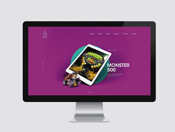
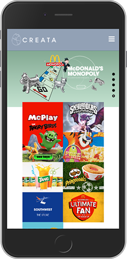
From prospective employees to future clients, no one knew what it was exactly that Creata even did. The previous website explained NOTHING, except they considered themselves a group of people that like to “PLAY”.

I fixed that!

Objectives

  1. Create an efficient and more effective way to tell potential clients what it is Creata does for their clients.
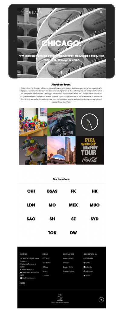
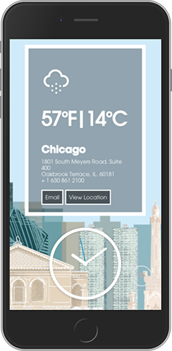
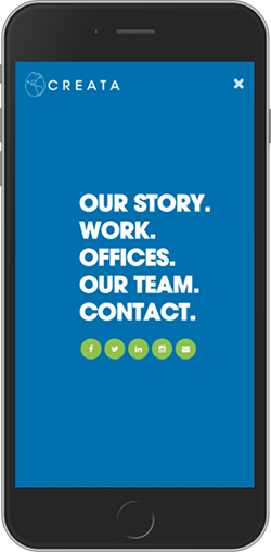
  2. Improve the sites responsive design to achieve a more effective mobile experience for visitors.
  3. Create a process that will allow the creative team to accommodate updates while keeping a consistent look and feel to the Creata brand.
Step 1.

Wireframing from Research

1.0 Homepage: The homepage will be an immersive and enriched experience combining video and high-level info to give an at-a-glance introduction to Creata, through several different content mechanisms aimed at our different targets.

1.1 The first interaction the user will have with our brand will be through an auto-play video showing people engaging with our products — ranging from child to adult interactions—to capture the spirit behind what we do and why we do it.

1.2 Simple, bold and powerful messaging will also appear to emphasize Creata as a global brand innovation and activation company that brings to life these experiences through branding, product design, marketing and more.

1.3 Next users will see snapshots of Case Studies & Recent Work, linking them to the project pages. A portion of these snapshot pieces will be globally focused and globally controlled, while others will be locally focused and locally controlled.

1.4 Current Employees with the proper credentials will be able to log in and showcase non-public content for demonstrations. The content they choose to show is save-able.

1.5 Messaging will next appear to emphasize Creata as innovators in play.

1.6 Next users will see snapshots of News & Insights, linking them to the actual content pages. A portion of these snapshot pieces will be globally focused, while others will be locally focused. All are globally controlled.

Section No. 3

High-Fidelity Mockups

Creata.com Web Experience

The site will be built using a fluid Responsive Web Design (RWD) and work across desktop, tablet and mobile devices.

The pages and design will be implemented using a custom WordPress theme.

The HTML markup on the site will be built to be compliant with the Civil Rights Act Title VII sections 504 and 508 W3C standards. Guidance from the WCAG 2.0 standards will also be followed as the address the more common HTML5 accessibility needs.

Desktop browser expectations – The site will be fully functional and nearly visually identical in the following browsers:

  • Chrome – Newest version (note: auto updates)
  • Firefox – Newest version (note: auto updates)
  • Safari – OS X 10.10 “Yosemite” and above
  • Microsoft Edge – Newest version (note: auto updates)
  • Microsoft Internet Explorer
  • IE11 (IE10 and below is no longer supported by Microsoft)
Section No. 2

With looks to kill competition

Even the all-powerful Pointing has no control about the blind texts it is an almost unorthographic life One day however a small line of blind text by the name of Lorem Ipsum decided to leave for the far World of Grammar. The Big Oxmox advised her not to do so, because there were thousands of bad Commas, wild Question Marks and devious Semikoli.